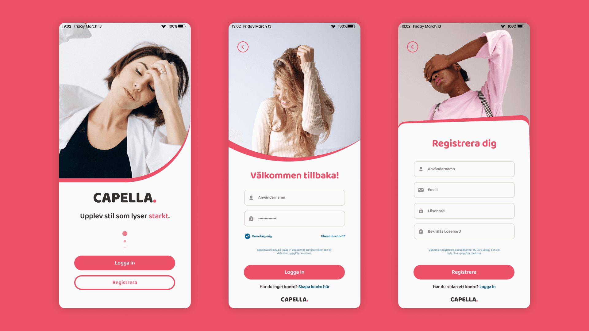
Capella is a recreation of an elevated e-commerce experience for fashion retail, delivered under NDA for a client seeking a visual overhaul and improved conversions. Tasked with replicating and enhancing an existing design, the project spanned brand identity creation, responsive UI design, and optimized user flows for shopping and checkout.
Personas
- Erik, 28, Fashion Enthusiast: Values trend discovery, easy product comparison, and quick checkout.
- Anna, 35, Busy Parent: Seeks frictionless mobile shopping, clear pricing, and accessible navigation.
- Samira, 24, Student: Shops for sales, prefers visual browsing, and desires transparent delivery information.
Problem Statement
Shoppers were disengaging due to inconsistent visuals, confusing navigation, and a cumbersome checkout experience. The brand lacked distinct identity, and the prior mobile interface didn’t support rapid product discovery or efficient payment flows.
Research & Insights
Extensive competitor benchmarking and user interviews highlighted these priorities:
- Visual clarity and compelling product imagery encourage browsing.
- Prominent calls-to-action (Add to Cart, Pay Now) improve conversions.
- Trust signals like free shipping, ratings, and secure payment boost comfort.
- Mobile-first, responsive layouts drive engagement and accessibility.
- Clear categorization, filters, and straightforward cart management are essential for diverse user needs.
Design Solutions
Brand Identity
- Developed a recognizable logo, modern typography, and warm color palette (notably coral pink) to express the brand’s friendly, fashion-forward personality.
- All digital and offline materials leveraged consistent visuals to strengthen brand recall.
Navigation & User Flows
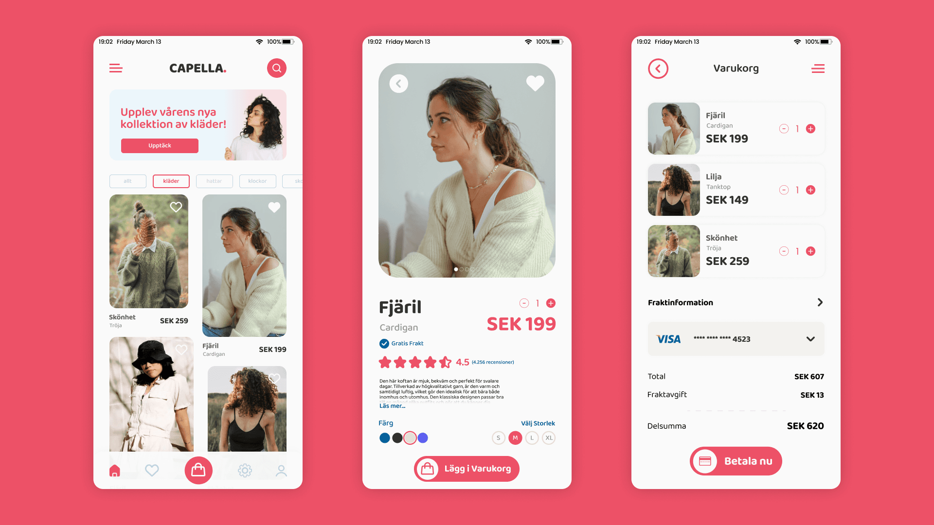
- Home screen prioritizes new collections, with category filters for effortless product discovery.
- Product page spotlights the item with crisp imagery, price, detailed information, ratings, size/color selectors, and persuasive calls-to-action.
- Cart and checkout flows are streamlined, summarizing selected items, transparent pricing, delivery info, and secure payment options for speed and reassurance.
- User Flow Example:
- Home → Browse Category → Select Product → View Details → Choose Size/Color → Add to Cart → View Cart → Confirm Details → Enter Payment → Pay Now
Visual & UX Optimizations
- High-quality images highlight products and create emotional connections.
- Microcopy and rating visuals motivate purchase decisions.
- Accessibility and responsiveness ensure usability for all devices and reading levels.
- Filters and sorting, quick cart management, and single-action checkout minimize friction.
Testing & Refinement
- Usability testing illuminated points of confusion, leading to revisions in filter placement, cart UI, and payment flow.
- User feedback confirmed increased satisfaction with browsing speed, checkout simplicity, and visual brand appeal.
Results
- Branded consistency increased user trust and engagement.
- Conversion rates improved through persuasive CTAs and a frictionless checkout.
- Mobile usability and accessibility supported global expansion and inclusivity.
- Efficient collaboration and adherence to best practices ensured timely, high-quality delivery.
Summary
The Capella e-commerce mobile app demonstrates the impact of user-centric design, cohesive branding, and best-in-class UI/UX on business outcomes. Smart navigation, clear visual hierarchy, and effortless checkout collectively enhance engagement, drive sales, and establish a strong, memorable brand presence.